|
|
Post by Clouseau on May 21, 2006 17:29:20 GMT
at the top of each page of the site, you'll notice an area right now that says, "Therapeutic Pink Message Board"... if someone would like to create a banner for the site to post in that spot, it'd be much appreciated... i may have a go at it myself, as well, but if there's enough interest, perhaps we'll have a poll to see which banner ought to become the official banner... sound fair?  |
|
|
|
Post by Mancini on May 21, 2006 17:59:44 GMT
How big should it be?  |
|
|
|
Post by Clouseau on May 21, 2006 18:04:22 GMT
lets say the maximum size should be about 460x70 pixels... it can be smaller, but it probably shouldn't be much bigger... the minimum, i guess, should be about 340x50 pixels... |
|
|
|
Post by Clouseau on May 24, 2006 1:39:23 GMT
ok, here's my first attempt at a banner... what does everyone think?  |
|
|
|
Post by Mancini on May 24, 2006 17:48:16 GMT
|
|
|
|
Post by Dreyfus on May 24, 2006 20:20:34 GMT
 Thats my attempt. It may be copyright not sure. |
|
|
|
Post by Clouseau on May 24, 2006 23:49:21 GMT
Mancini, i think you're on the right track, but i like Dreyfus' fonts better... the images on the sides of that one look weird, though, and i think the whole thing looks like maybe it's low resolution or something... i tried to clean up Dreyfus' "PINK" font and use it as part of my first banner... i also expanded the length of the thing slightly, cuz i thought it might fit the spot better this way... lemme know what y'all think...  do you guys like it better with the white letters, or the black letters? |
|
|
|
Post by Mancini on May 25, 2006 16:40:44 GMT
How about with a black background?  |
|
|
|
Post by Dreyfus on May 25, 2006 16:47:58 GMT
They are both really good. I slightly prefer the black background though
|
|
|
|
Post by Clouseau on May 25, 2006 21:15:19 GMT
i like that last one a lot, Mancini... here's another variation i came up with... 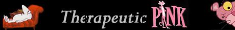 |
|
|
|
Post by Mancini on May 26, 2006 15:08:12 GMT
That's *nearly* perfect, only there seem to be some black vertical lines going through the "e" and "c" of "therapeutic", as well as the panther's ear....  EDIT: I fixed it (I think).  |
|
|
|
Post by Clouseau on May 26, 2006 16:43:30 GMT
sweetness... does everybody agree on that last one, then? or do we wanna keep trying? lemme know what you think..
|
|
|
|
Post by Mancini on May 26, 2006 21:30:34 GMT
Well you could put it up anyway - there's nothing stopping you changing it later on. |
|
|
|
Post by Clouseau on May 26, 2006 21:41:00 GMT
i think i'll do that... if somebody comes up with something better, i'll just make a swap then... |
|
|
|
Post by Clouseau on Jul 31, 2006 4:12:20 GMT
hey folks... just happened to think that perhaps we should try something different... what if we dropped the panther at the far right, scooted the title over to the left just a little, and added an image of either Peter Sellers or the Inspector character on the right side, as if he's looking for the Panther or something... i'm just thinking maybe that would help to show visitors from the beginning that the site is about more than just the cartoons, you know?? i dunno... i just wondered what the rest of you thought about that... |
|